What Colors Did Gen X and Boomers Actually See Every Day?
This isn’t about taste.
It’s about which colors were actually used, by whom, and where people repeatedly saw them between the 1950s and the 1980s.
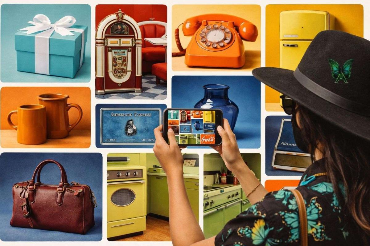
Below are 10 classic colors that show up again and again in real products, advertising, interiors, and consumer goods that Gen X and Boomers grew up with.
1. Tiffany Blue (#0ABAB5)
Where it appeared:
-
Jewelry packaging by Tiffany & Co. (widely recognized by the mid-20th century)
-
Print ads and storefront branding
Why it stuck:
The color was used consistently on boxes, catalogs, and ads. Repetition tied the color directly to premium goods and gift-giving moments.
2. Cherry Red (#D10000)
Where it appeared:
-
1950s diner interiors (booths, trim, signage)
-
Fast-food branding such as McDonald's
-
Classic cars (1950s–1960s American models)
Why it stuck:
High visibility. Red was chosen because it photographed well, stood out on highways, and remained legible on early signage and print ads.
3. Sunset Orange (#FD5E00)
Where it appeared:
-
1960s–70s automobile paint options
-
Mid-century modern furniture and plastics
-
Consumer appliances from brands like General Electric
Why it stuck:
Bright colors became feasible with new plastics and coatings. Orange signaled modernity and optimism in post-war product design.
4. Mustard Yellow (#FFDB58)
Where it appeared:
-
1970s kitchen appliances (refrigerators, stoves)
-
Wallpaper, sofas, and carpeting
-
Fashion collections of the 1970s
Why it stuck:
Earth-toned yellows hid wear and aging better than white and aligned with the decade’s interior design trends.
5. Burnt Sienna (#E97451)
Where it appeared:
-
Ceramic tableware and pottery
-
Interior paint and textiles in the 1970s
-
Casual menswear and leather goods
Why it stuck:
It worked well with wood, brick, and low lighting—common features in homes built or renovated during that period.
6. Cobalt Blue (#0047AB)
Where it appeared:
-
Glassware and ceramics by Iittala
-
Decorative tiles and tableware
-
Modernist interiors
Why it stuck:
Cobalt pigments were stable at high temperatures, making them practical for glass and ceramics while remaining visually striking.
7. Navy Blue (#000080)
Where it appeared:
-
Corporate branding (banks, insurance companies)
-
Business suits and uniforms
-
Logos such as American Express
Why it stuck:
Dark blue reproduced reliably in print and conveyed seriousness without the harshness of black.
8. Avocado Green (#6A7F41)
Where it appeared:
-
1970s kitchens (appliances, countertops)
-
Bathrooms and carpeting
-
Product lines from Whirlpool
Why it stuck:
Green was marketed as “natural” and modern at the same time, fitting suburban home aesthetics of the era.
9. Deep Burgundy (#800020)
Where it appeared:
-
1980s fashion and upholstery
-
Luxury car interiors
-
Designer collections by Yves Saint Laurent
Why it stuck:
Darker reds photographed well under studio lighting and conveyed richness during the 1980s shift toward visible luxury.
10. Tangerine (#FF6A13)
Where it appeared:
-
1970s advertising and packaging
-
Furniture accents and plastics
-
Soda and snack branding including Pepsi campaigns
Why it stuck:
Bright orange increased shelf visibility and contrast on television and print, especially before digital color correction.
Straight Answer Summary
These colors didn’t become “classic” because people felt nostalgic about them later.
They became classic because:
-
They were used repeatedly
-
By large, visible companies
-
On objects people saw daily
-
With materials and printing methods of their time
That repetition is what made them “old school cool.”

